
Contributors:Kari Goin Kono, Misty Hamideh, Lindsay Murphy
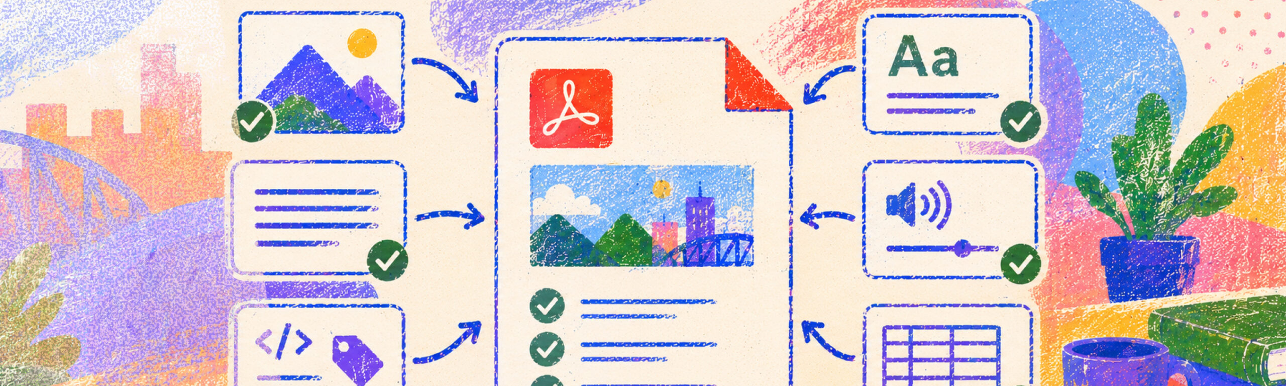
This guide outlines essential strategies for ensuring your instructional slides meet digital accessibility standards. Learn top priorities, including using built-in slide layouts, adding descriptive alt text, and checking reading order, to create a clear and inclusive learning environment for all students.
Digital accessibility changes for PSU faculty
In April 2024, the U.S. Department of Justice updated Title II of the Americans with Disabilities Act (ADA) to set clear requirements for accessible web content and mobile applications used by public entities, including public universities. The rule adopts WCAG 2.1 Level AA as the technical standard. The original compliance date of April 2026, has been extended and the new compliance deadline for PSU is April 26, 2027. Learn more about Title II compliance at PSU.
What are my top priorities for creating accessible slides?
- Give every slide a unique title. Every slide needs a descriptive title, even if it’s “Introduction (Continued).” Unique titles help students navigating by a slide list know where they are. Avoid generic titles such as “Slide 1” or “More Information”. For example: instead of “Graph,” use “Trends in Renewable Energy Use (2023-2024).”
- Use built-in slide layouts. Use built-in title, subtitle, and content layouts instead of manually adding text boxes whenever possible. Slide templates provided by the software will ensure the content stays in the correct structural “containers.”
- Check the reading order. Screen readers read elements in the order they were added, which is often backwards. Use the Selection Pane (PowerPoint) or Tab (Google Sheets) to confirm the order makes sense.
- Only use simple tables. Slides can only support a table with one row or column of headers (i.e., a simple table); complex tables (with two or more rows/columns of headers) need to be formatted in Excel or other software. Avoid merging or splitting cells, and don’t forget to add a caption!
What do accessible slides look like?
To illustrate best practices, let’s review a comparison of inaccessible and accessible slide design elements.
Inaccessible slide design
- Generic slide titles (e.g., "Slide 1," "More Info")
- Manually added text boxes without headings and/or built-in text boxes without content
- No alternative text for images
- Low contrast text (e.g., light gray on white background)
- Dense text with little white space
- Confusing navigation order (identified by testing using the Tab key)
- URLs displayed instead of descriptive links (e.g., "www.oaiplus.pdx.edu/creating-accessible-course-materials")
Accessible slide design
- Unique, descriptive slide titles for easy navigation
- Content is placed in built-in title, subtitle, and text boxes, and text layouts with a logical reading order
- Alt text added to all images, graphs, and charts
- High contrast color schemes (e.g., dark text on a light background)
- Adequate white space for readability
- Logical reading order confirmed using the Tab key
- Descriptive links (e.g., "Creating Accessible Course Materials on OAI+")
What should I do next to make my slides even more accessible?
- Improve visual accessibility
- Check color contrast using tools like the WebAIM Contrast Checker to ensure sufficient readability.
- Use at least a 24-point font size for body text and a 32-point font for headings.
- Leave sufficient space between sections to reduce visual clutter.
- Add structural and contextual support
- Include speaker notes for additional context, especially if slides are shared asynchronously.
- Update your slides to include page numbers to help students navigate and track their location within the content.
Start with a PSU template
Use this ready-to-go template to get started quickly. It’s already set up with accessible structure and formatting.
This slide deck is already available in your Google Slides templates. To use it: Go to Google Slides, select Template Gallery at the top right of the home screen. Be sure to select the Portland State University tab. Alternatively, within an open presentation, select File > New > From template gallery.
Where can I find more accessible slide resources?
Step-by-step guidance on accessibility features.
Detailed guide with screenshots and step-by-step instructions.
Tools for creating accessible slides in Google Slides.
Video overview of how to create an accessible presentation in Google slides.
Take the PSU Instructional Digital Accessibility Training!
For more in-depth, structured learning about digital accessibility, OAI offers an asynchronous training course for instructors.
Includes directions on how to:
- Apply WCAG guidelines to your content.
- Identify accessibility barriers in learning content.
- Conduct self-evaluations of digital content.
- Remediate inaccessible content based on best practices.
- Integrate cognitive accessibility principles for diverse learners.
- Plan for accessible content creation in the future.

Instructional Digital Accessibility Training
Take this Canvas course for an introduction to digital accessibility in higher education. Course…
You might also like


👋Need more help?
Submit a support request through our Faculty Support portal for assistance.